Project Overview
I was fortunate to work in a UX design internship with Social Currant, a startup committed to making a positive impact on society. This experience introduced me to fresh challenges and allowed me to work closely with the CEO, CTO, Design Lead, and my fellow interns, shaping a truly dynamic learning journey.
Working with Social Currant was an exciting shift from the norm; it's not your typical problem-and-solution journey. There were hardly any UX processes, no double diamond from start to finish. I know, quite a challenge to comprehend, isn't it?
Team 🧑🤝🧑
4 UX Designer Interns
Engineer Lead
Project manager
Design lead
Tools 🛠️
Figma, Zoom, Linear, Notion, Google Suite
Project Timeline ⏳
2.5 months
My Role 👩🏻💻
UX Design Intern
Client Background
Social Currant is a startup that has set its sights on creating a social impact platform, uniting brands and creators with like-minded partners to support various social causes. Their mission is to foster positive change within the community through collaboration and collective efforts.
Our main goals?
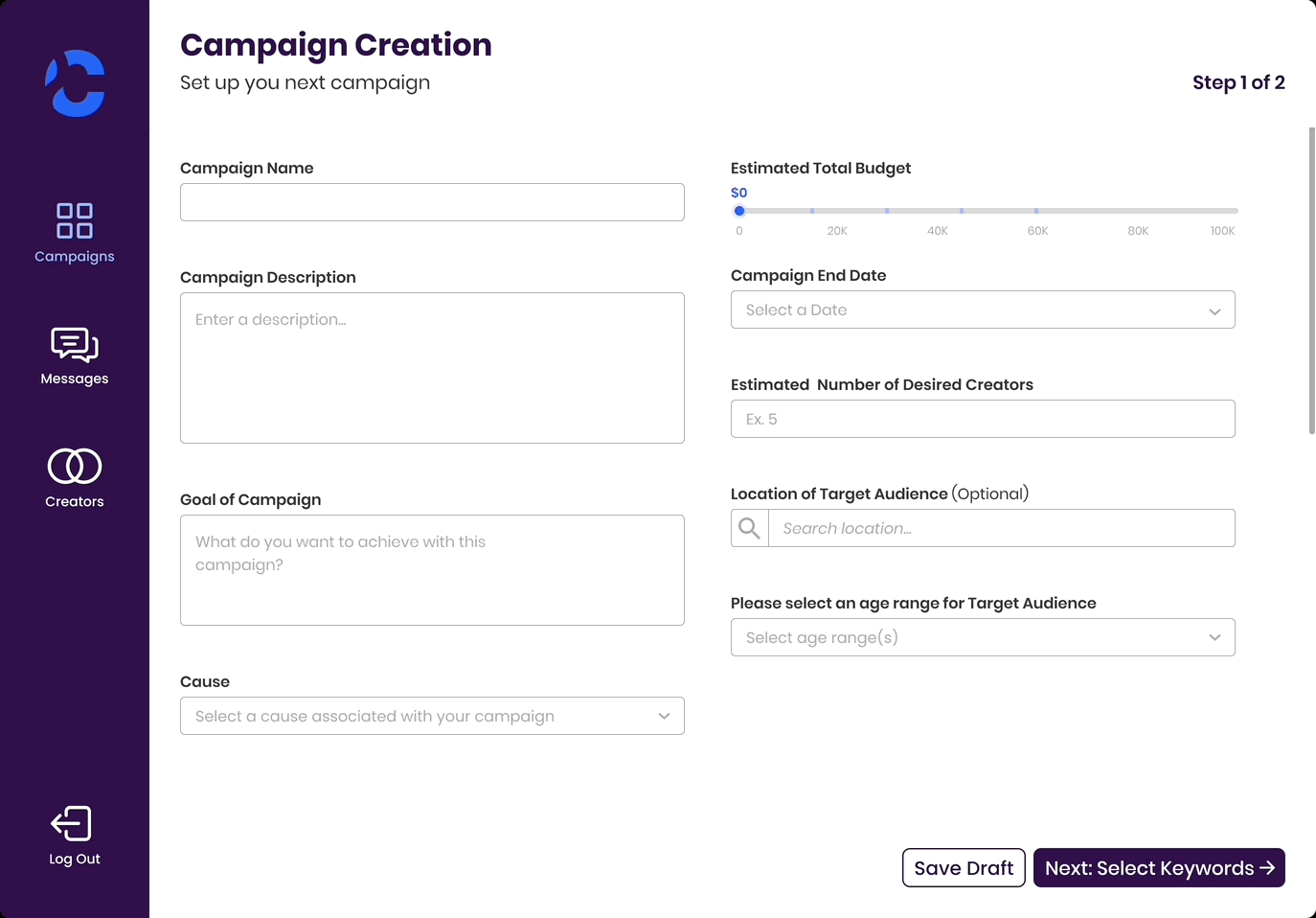
The primary goal of this project was to enhance the user experience of Social Currant's platform, focusing on a litany of UI tasks we were assigned to help the platform be ready for VidCon and other presentations to secure funding.
Design
Starting the process
Most of our tasks were centered around updating their current wireframes. Because of the need for quick deliverables, we took an agile approach to the design process, working in iterative sprints on whichever screens were the focus.
We kicked things off with open discussions and brainstorming with the whole team, aiming to identify wireframe needs and enhancements for specific designs. We would then take these ideas into Figma and start creating wireframes and visual designs of key screens based on the existing screens. We would then iterate based on prompt feedback from the Social Currant team.

Getting Matched
The first thing I worked on was the matches page that brands would eventually reach to select creators for their campaign. Before we started, the Design Lead walked us through what the current screens looked like and what would be ideal for the new screens.
We made a list of “must have” that the screen has to show:
4-6 creator cards on the page
select creator and view profile buttons
keywords
name and username
profile picture
save, rate, and causes
With that, we got to work in a design studio workshop where we each jotted down our ideas for the screens. When we shared our ideas, we quickly realized we were all very much on the same page.
Our priority was to make sure that users could comfortably view multiple cards on a single screen and which would also adapt seamlessly when transitioning to different devices, like tablets and smartphones.
Original Matches Page
Updated Matches Page
We worked through several versions of the creator cards, working through different sizes and layouts highlighting the causes, metrics, keywords.
This is our end product, showing different variations of the the state of the cards. We successfully included everything in our “must haves” list. As you can see from the previous version, our progress is unmistakable.
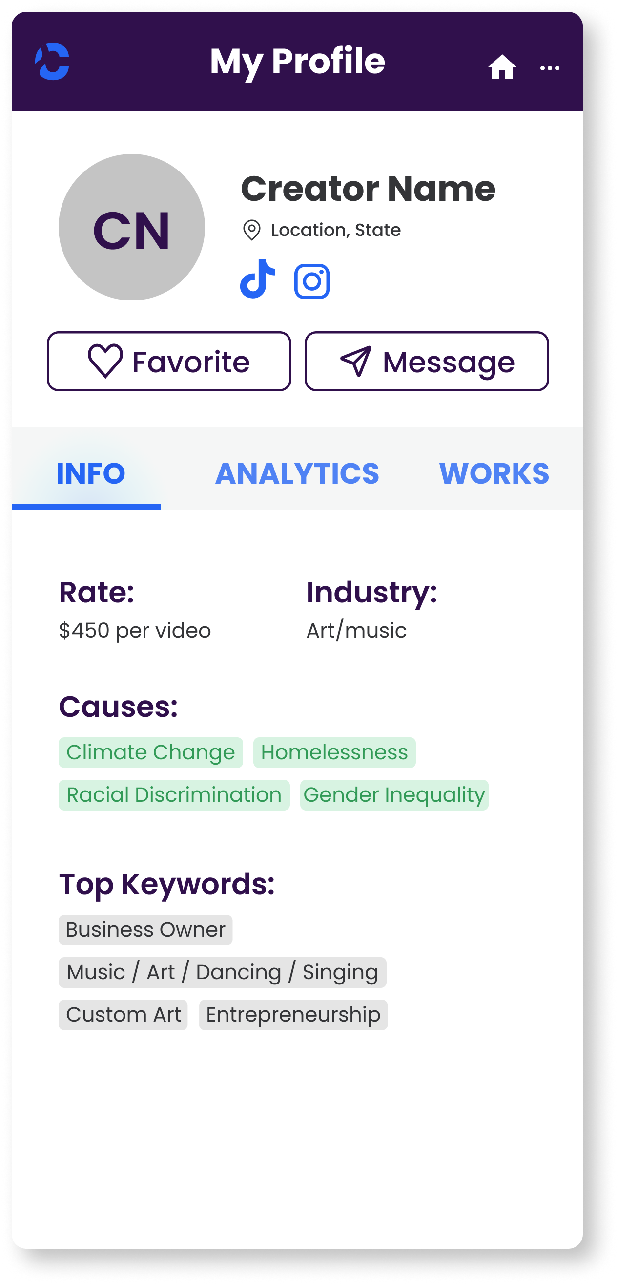
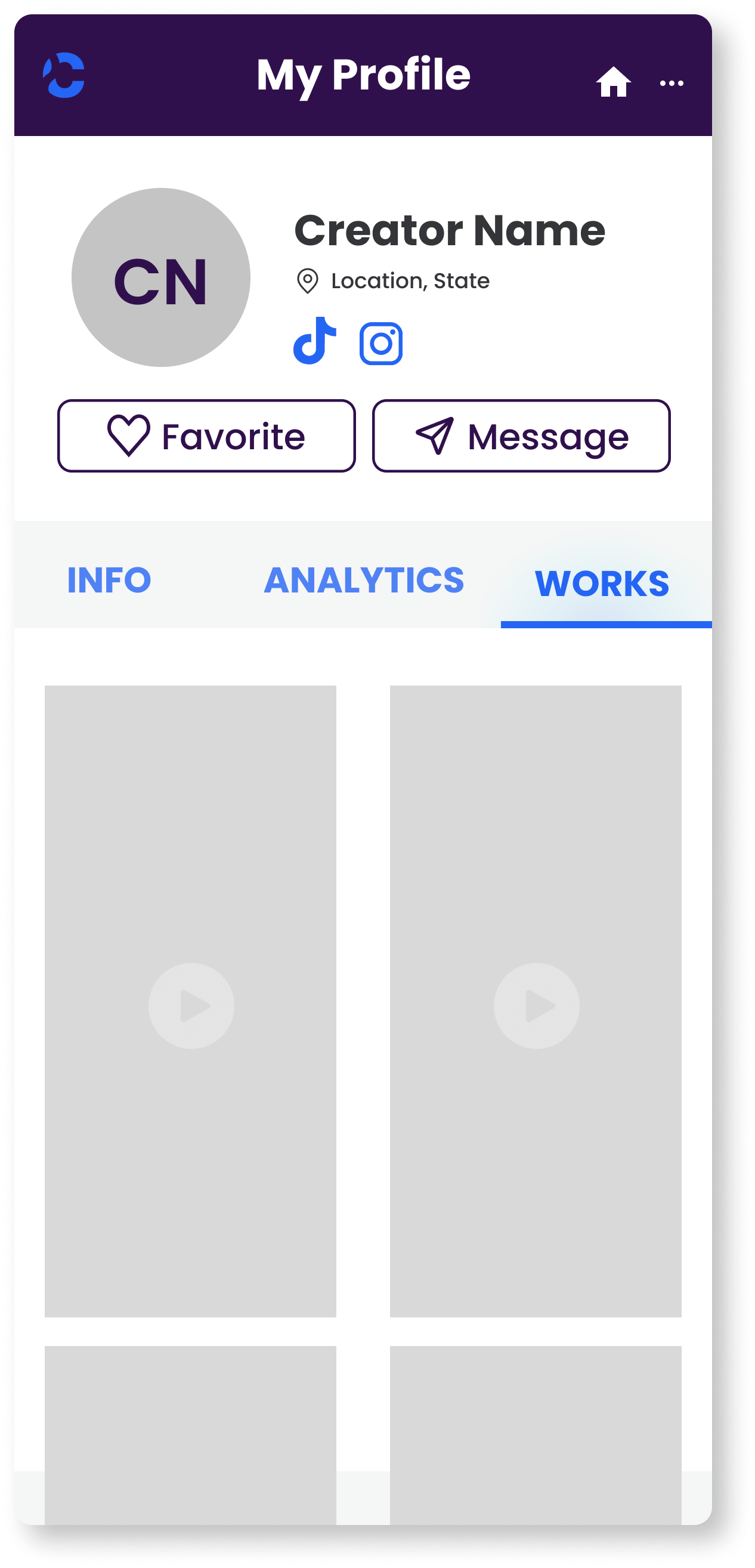
Profiles
Next up were the profiles, where brands could access information and metrics about the creators. Before we started brainstorming, the Design Lead showed us some screens that were created by an outside team previously.
Previous Profile Screens
We walked through these frames to help us establish some essential elements for the profiles screens. We decided on this set of “must haves” for the profiles:
circular profile picture
causes
keywords tag
availability marker
avoid an excess of white space
With another design studio workshop, we put together our designs and got to work on the mid-fidelity wireframe.
The aim for the profiles was to ensure brands could view the metrics that were important to them, no matter the platform.

Mobile Creator Profiles
Prototype
They’re called skeleton loading screens…
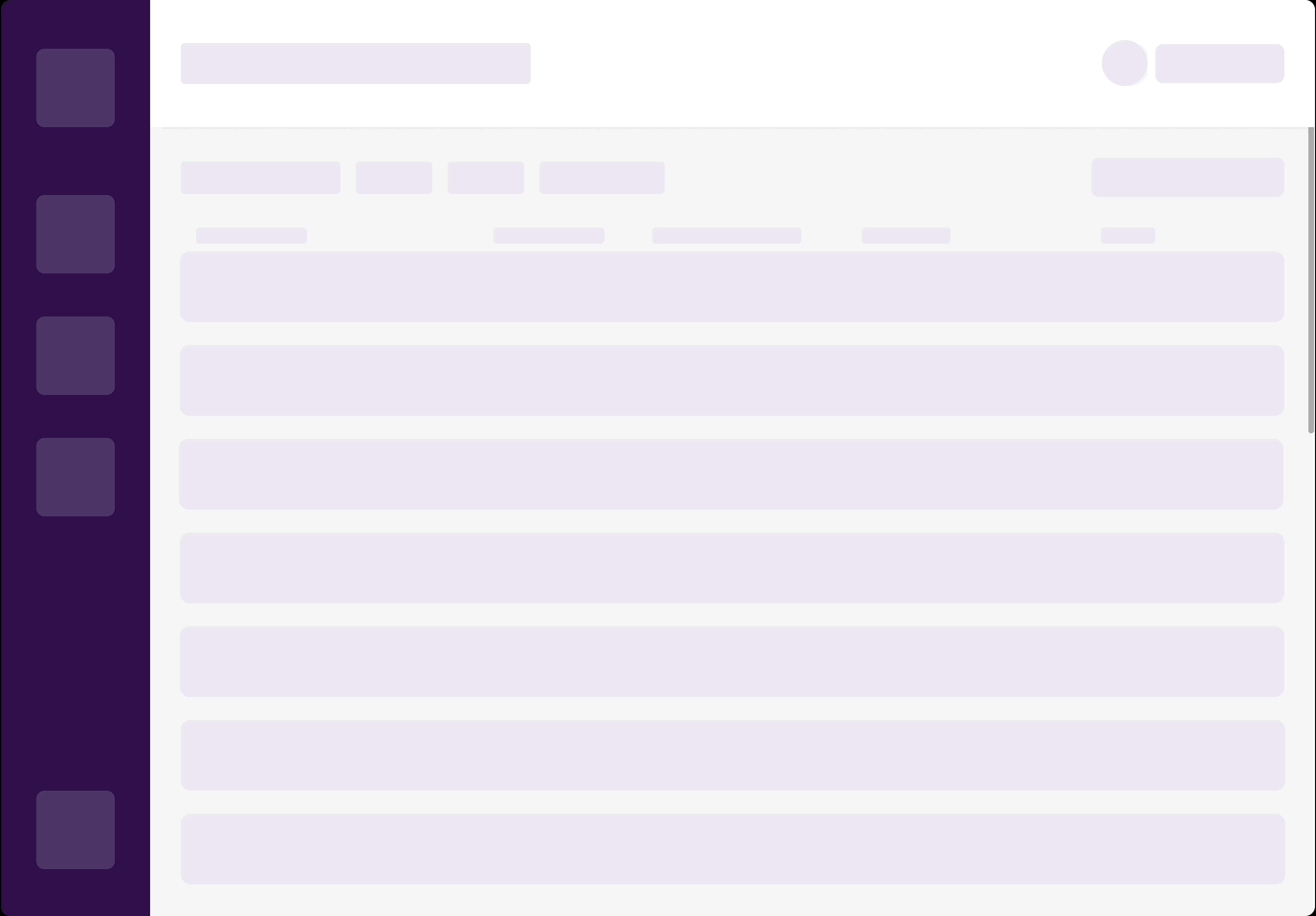
Our next task involved creating skeleton loading screens for both existing and new frames, a concept that was entirely new to us.
We initially had little knowledge about these screens or how to build them, but with a combination of YouTube tutorials and collaborative teamwork, we quickly got the hang of it. We got to work and started building out the loading screens for all the built out frames. Here’s another!
Design
Lastly, the landing page!
Our final challenge centered around the landing page. Just like our approach to the other screens, we first talked about the changes that needed to be made before a discussion to outline the essential sections.

After gathering inspiration from various landing pages, we got together for our last design studio workshop. Through extensive deliberation, we shaped our initial sketches and efficiently divided responsibilities for constructing the components within Figma.

Our Frankenstein-ed draft

Built out landing page
Key Takeaways
Achievements and Milestones
In the end, our collective efforts culminated in a resounding success. Not only did we meet the deadline, but our dedicated work proved instrumental in elevating Social Currant's presentation at VidCon, securing crucial funding!
Our work also helped Social Currant achieve an even more remarkable milestone – acceptance into Cohort #6 of Higher Ground Labs, an accelerator in the political tech space highlighting companies building for change in America.
Uncharted Waters
This project also marked the first time working alongside skilled engineers in UX design. It also introduced working with different and some times unfamiliar limitations was a bit of a learning curve but collaboration helped us overcoming these challenges.
Looking back at the entire journey, this experience holds a special place. It truly showcases how adaptability, creativity, and teamwork are the cornerstones of success. These factors together paved the way for a brighter future, aligning perfectly with Social Currant's vision of progress and positive transformation.
Thanks for reading!