Project Overview
Taking part in a hackathon, I collaborated in a cross-functional team of 5 UX Designers and 5 Software Engineers to undertake a website redesign hackathon for a non-profit organization.
We chose Bottomless Closet, established in 1999, a non-profit organization dedicated to inspiring and guiding disadvantaged NYC women into the workforce.
Overview
Project Timeline ⏳
5 Days
My Role 👩🏻💻
UX Design Intern
Tools 🛠️
Figma, Zoom, Linear, Notion, Google Suite
Team 🧑🤝🧑
5 UX Designer Interns
5 Software Engineers
Our main goals?
The hackathon's primary goal was a comprehensive website redesign for Bottomless Closet, optimizing user experience, addressing accessibility challenges, and seamlessly integrating new features in collaboration with developers.
Challenges
Compared to other non-profits, Bottomless Closet took many clicks to reach the donation page. Several links led users to different sites, further impacting the user experience. And most importantly, there was no direct help for clients to access the tools they need, a significant drawback compared to competitors.
Our Approach
Redesigning to create a more accessible, user-friendly platform that provides clear direction for women seeking workforce entry, ensuring tailored support and resource accessibility(attire, resume help, interview prep, and workshops) while using Bottomless Closet.
Research
Our Research Process
With constrained timelines, our team delved into swift research. We started with a competitive analysis, heuristic evaluation and rounding it up with usability testing.
Usability testing: Evaluate the effectiveness and user-friendliness of the current Bottomless Closet website, and to understand user preferences and challenges
Competitive Analysis: Gain insights into industry best practices and assess the digital landscape of similar organizations
Heuristic Analysis: Assess the usability and user experience of the website, employing recognized heuristics to identify potential usability issues and guide design enhancements.
Usability Testing - Round 1
We conducted usability tests on the original website and found that users faced challenges across all three of our proposed tasks.
Task 1: Find the mission statement
Task 2: Seeking career help
Task 3: Registering for a workshop
Results revealed significant issues: low success rates, difficulties in completion time, and poor ratings in terms of ease, credibility, and enjoyment reinforcing the need for our solution.
Competitive Analysis
Key Takeaways
Compared to other non-profits, Bottomless Closet took many clicks to reach the donation page. Several links led users to different sites, further impacting the user experience. And most importantly, there was no direct help for clients to access the tools they need, a significant drawback compared to competitors.
Heuristic Analysis
Key Takeaways
The heuristic evaluation showed us the inconsistencies throughout the site, missing buttons, broken links and the inefficiency as well as the lack of error prevention.
Problem
How can we create a user-friendly system within Bottomless Closet to guide women entering the workforce, offering personalized support and easy access to resources like attire, resume help, interview preparation, and workshops?
Solution
Improve the Bottomless Closet website by incorporating a clear mission on the homepage, optimizing the header, and simplifying page hierarchy. Improve 'Client Services' for clarity, enable seamless online onboarding and scheduling, and provide a convenient donation opportunity directly on the homepage.
Collaboration with Developers
Throughout the design and implementation process, close collaboration with developers was very important. Regular meetings, iterative feedback loops, and joint problem-solving ensured a seamless integration of design elements with the technical aspects of the website.
We also held a design studio where the developers actively contributed to decision-making on the feasibility and efficiency of design features, fostering a cohesive and functional end product.
Design
Our Design Story
For our redesign we took many things into consideration. From high level changes like user flows to the small details like fonts and color styles.
Colors and Fonts
Accessibility
Mid-Fidelity
Solutions
Color
We kept their brand color red as our main color for the site, while adding in some complementary colors. However we did have to change their original hue. When we tested their original color red it did not adhere to accessibility standards for color contrast, and so we adjusted the colors and used contrast grids to ensure readability.
Homepage
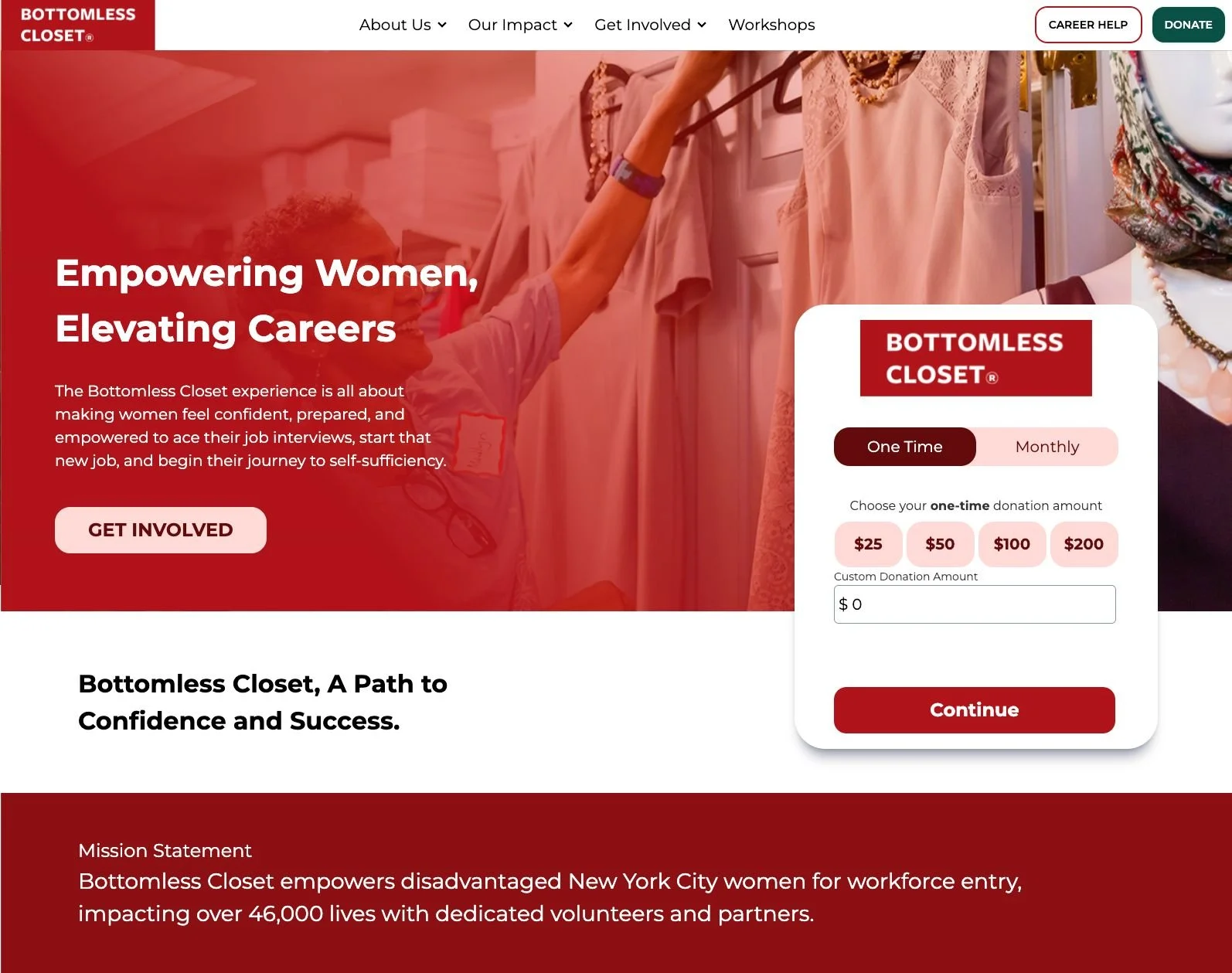
For our homepage we made information clear and convenient for both donors and new clients.
By simplifying our top nav, creating a CTA for career help, and clarifying what Bottomless Closet is.
History & Mission
Users had trouble finding the company's mission on the history and mission page. We fixed this by making the mission the top priority and cleaning up the rest of the other content.
Donation
The donation process was confusing for our users and didn't use space well. Our researched led us to believe it didn't need its own page. Now, it's lives on the homepage, making it easy for donors and breaking the donation process into steps.
Workshop Registration
For workshop registration users struggled to find the right courses, so we put the descriptions right on the event listings page so users could understand exactly what each course was about before having to navigate to another page. We also simplified the registration process to be just a simple button click and form fill out.
Onboarding
Last but not least, we added an easy-to-find guided online onboarding flow that replaces the old client registration which required users to dig through lots of text to find an email that they had to reach out to on their own. Our new flow is both intuitive and exciting for prospective clients.
Usability Testing Round 2
Compared to the original site, our Hi-fi designs performed far better in all aspects we measured. Completing tasks for our users was 41% easier, 45% more successful, 52% faster, 22% more credible, and 89% more enjoyable
Key Takeaways
Achievements and Milestones
Our hard work, alongside the collaboration with developers, secured first place!
With more time, we envisioned conducting additional user interviews, running a second round of testing on our high-fidelity designs or our fully built site, and expanding the development of additional pages.
Check out the new redesign site here!
Thanks for reading!


